Home > UX Design > The Cultural Me

Learn how to speak fluently about the arts and culture
Have you ever wished that you had the ability to talk with confidence about the last art exhibition you visited? Have you ever been stuck for words when someone raises the subject of Shakespeare or Renaissance Art?
Culture is all around us. Being able to understand it helps to understand ourselves, empathise with others and apprehend the world we live in. The Cultural Me is a startup with one clear mission: help people to learn about the arts and culture as they would learn a new language.
Challenge
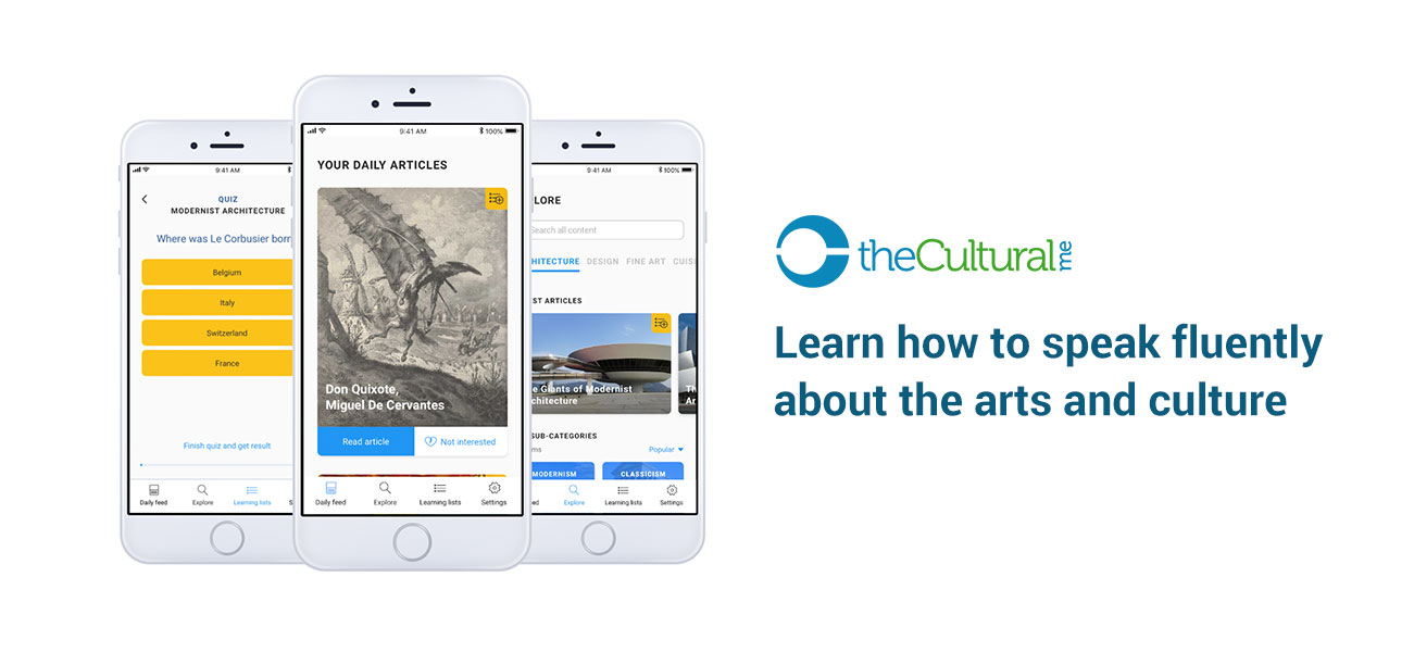
The app offers daily bite-sized articles and information on cultural events, all specially selected for each user.
The main client’s need specified in the brief is to design the user interface and process flow that would permit the user to select their preferences in the arts and culture. The user would then receive tailored content thanks to their AI-assisted learning algorithm. The content consists of custom written micro-articles on their selected interests as well as events in their city.
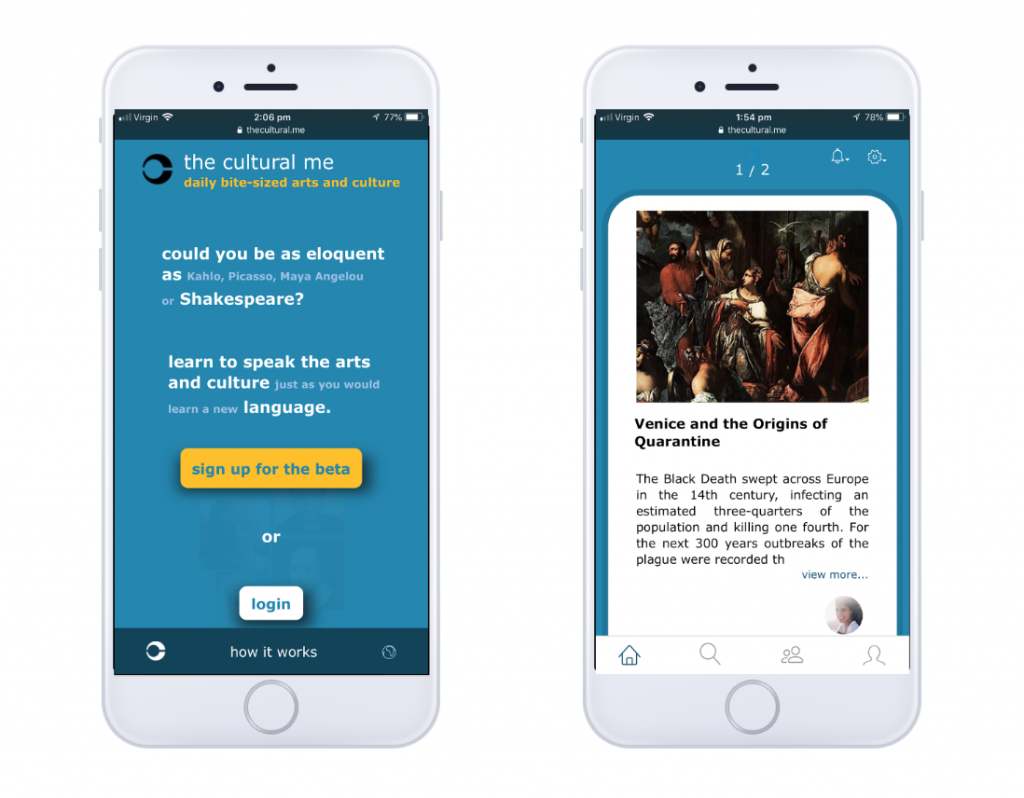
The Cultural Me app also offers the possibility of rating the items and creating custom lists, which also helps the learning algorithm to select the content to show. It has been around for over a year now and is in its beta phase.
Client The Cultural Me
Methodology Lean UX
Project duration 3 week sprint
Team
Brandon Pfeiffer · Facilitator
Nina Lukin · Cognitive Scientist
Andrew Cooper · UI Designer
Alicia Andrés · Project Manager
Research
Competitive analysis
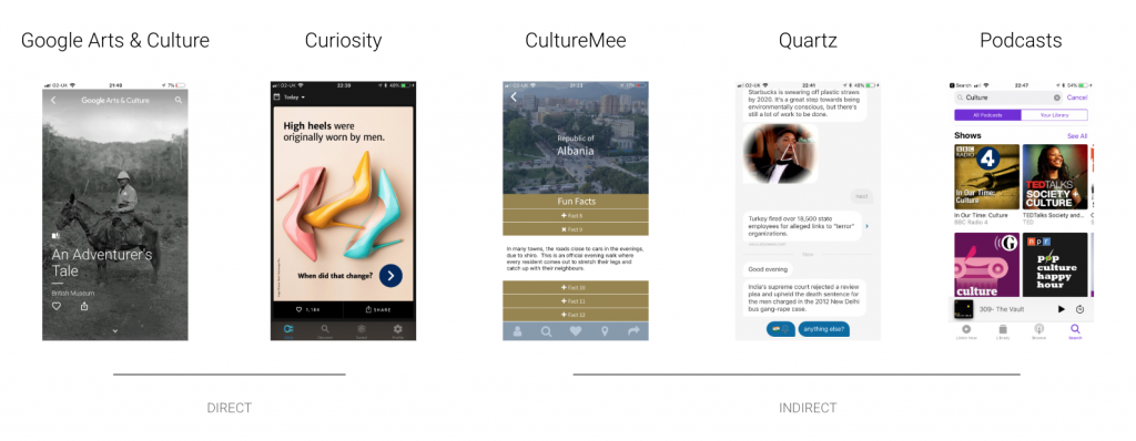
The competitors observed were chosen and evaluated on a number of varying features and categories, such as how is the content presented, category selection, content rating system or learning features.
Researching how competitors are creating experiences for users helped us to form an initial idea of the app structure and layout to apply to the current beta version whilst also solving the needs from the brief. Interestingly, none of these apps facilitates learning — they are just content delivery systems. And this is where The Cultural Me can really stand out.
User research
We conducted 13 interviews, taking into account users demographic levels in order to determine if they matched or were close to the motivations, experiences and demographics provided by the persona received from our client. The interviews covered a range of topics, behaviours, preferences and experiences related to learning habits and culture knowledge. This allowed for a number of insights to confirm previous research completed.
Insights
Short bite-sized text is preferred
Free time and commuting is the preferred time to learn
Subscription payments are common
Persona
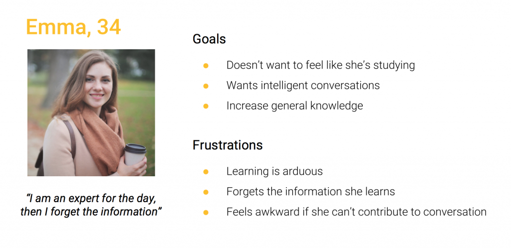
The analysis and synthesis through affinity mapping of what was learned in the interviews, lead us to create the persona of Emma. She highlighted various goals that would need to be addressed through the process of ideation and the future development of concepts.
Emma studied marketing and is working in a hectic environment, constantly meeting new people having to impress them. Business lunches and small talk with business partners are her everyday life. Curious about her environment, Emma always wants to learn more about things she comes across.
User journey
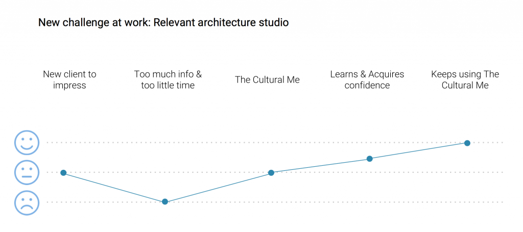
Emma has a new client as a PR: a relevant architecture studio that she wants to engage with. She finds out about a new app to learn about architecture easily and gives it a try. After a week is able to show her knowledge of interesting facts.
Definition of the problem
Problem statment
Curious people need a way to learn about their interest areas in the arts and culture because they want to increase their knowledge.
How might we…
…facilitate arts and culture learning for people who want to educate themselves but do not want it to feel like studying?
Hypothesis
We believe that by creating a learning platform, our users will be able to increase their knowledge of the arts and culture.
Ideation
Design studio
We conducted a design studio session with The Cultural Me, where we shared the insights from our research and discussed next steps. We ran a Crazy 8’s exercise to unleash our creativity focusing on selecting preferences and the learning feature to help the user memorise what they are reading.
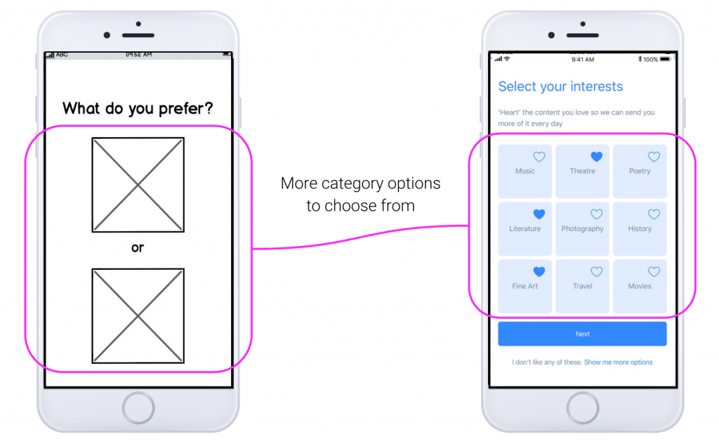
We decided it would be nicer if the selection for categories is visual, as is quicker and more fun. We would also keep the learning feature as a light touch because this is an MVP (Minimum Viable Product).
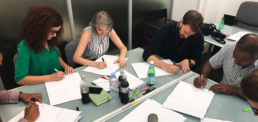
Having fun during the Design Studio workshop with stakeholders
Information architecture
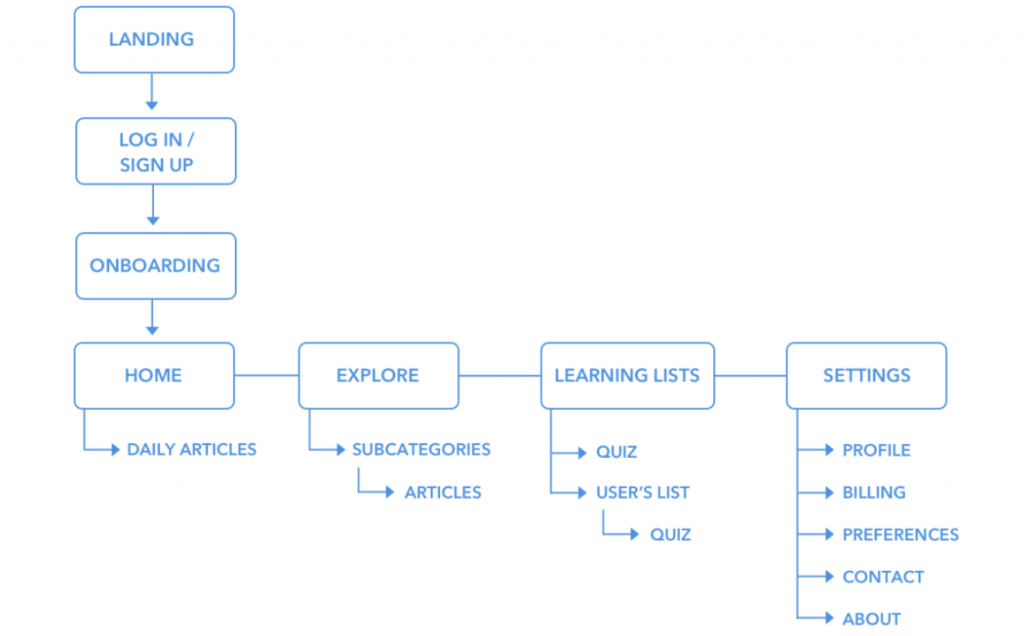
We specified the sections of the app:
- Home: Three daily articles are shown, selected based on the preferences the user has chosen.
- Explore: The category list where the user can keep tailoring his preferences.
- Learning lists: Created by the users based on what they want to learn.
- Settings: Details about the user’s profile, location, billing and contact details.
Lo-fi prototype
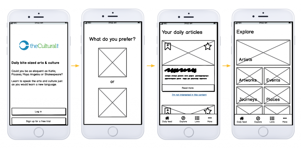
In order to start creating the wireframes, we concretise the user flow our persona, Emma, would follow the first time she used the app. We created the firsts low fidelity wireframes based on the previous flow.
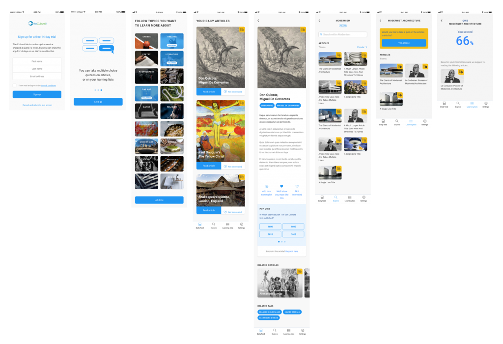
In the splash screen Emma, is able to log in or sign up for a free trial. The next screen would be where she selects her areas of interest and she would arrive to the home screen, where the articles based on her preferences appear. She would explore other topics in the ‘explore’ section.
Usability testing & Iterations
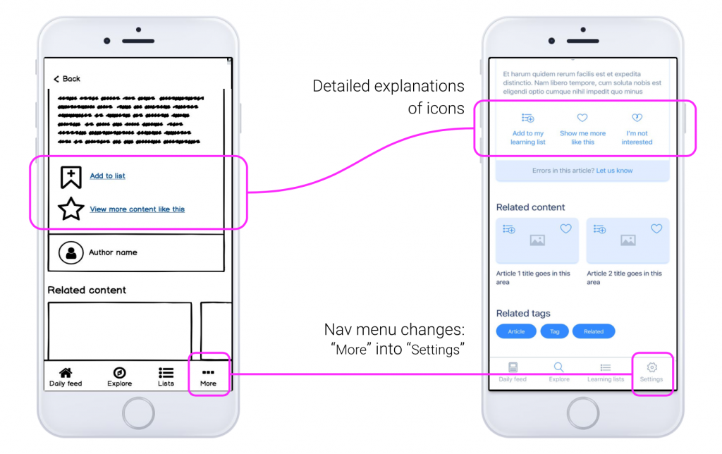
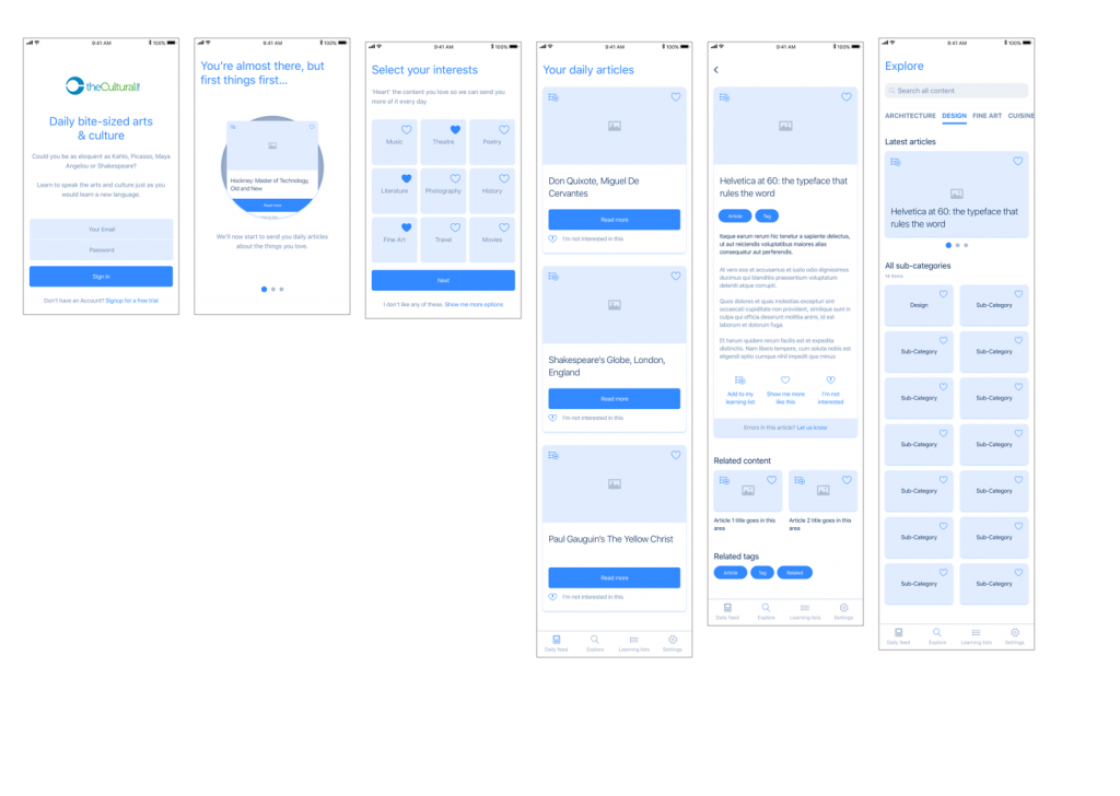
Running some usability tests helped us to improve several aspects in the hi-fi wireframes, as the onboarding preference selection, the layout of the articles and the learning feature. We created the high fidelity prototype based on the learning from the usability testing.
Hi-fi prototype
We created the high fidelity prototype based on the learnings from the usability testing.
Visual design
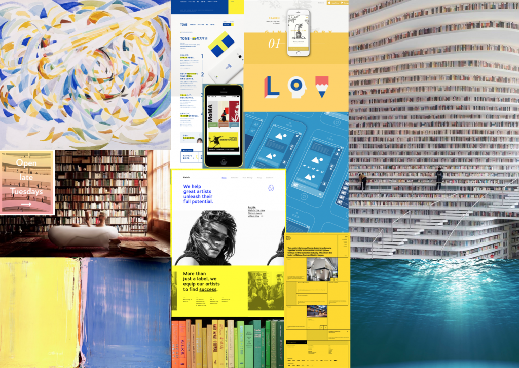
We created this moodboard to inspire the visual design for our proposal, setting the tone for a modern and clean aesthetics.
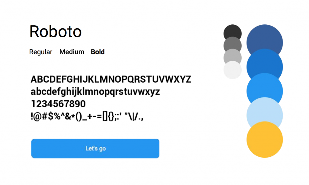
We also designed the style guide, based on the current style of the app through the use of the colour palette but looking towards the future, what competitors are doing and keeping in alignment into the field of where The Cultural Me aims to be placed in the future.
Final prototype
Visit the clickable prototype in InVision.
Read the full case study in Medium (7 minutes read).
< Back to 💻 UX Design

